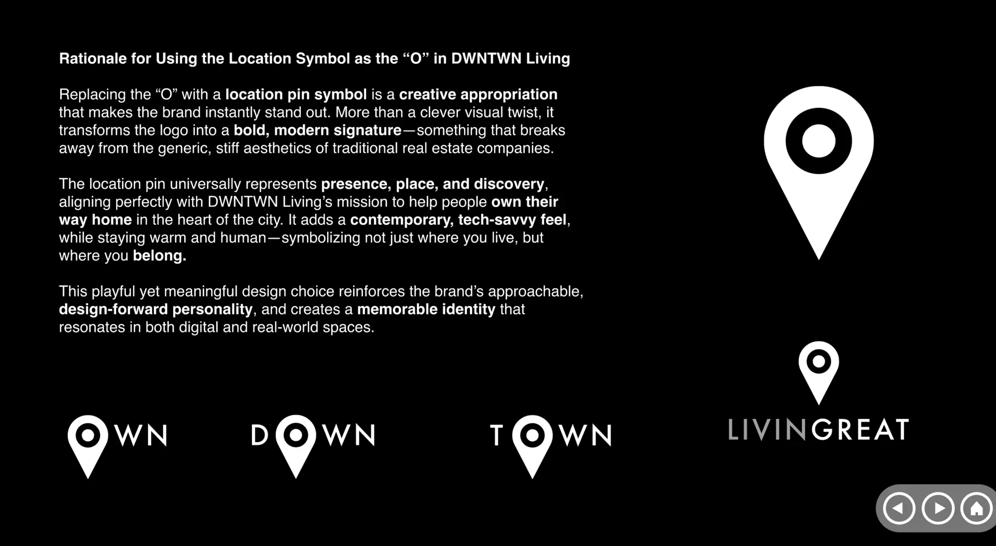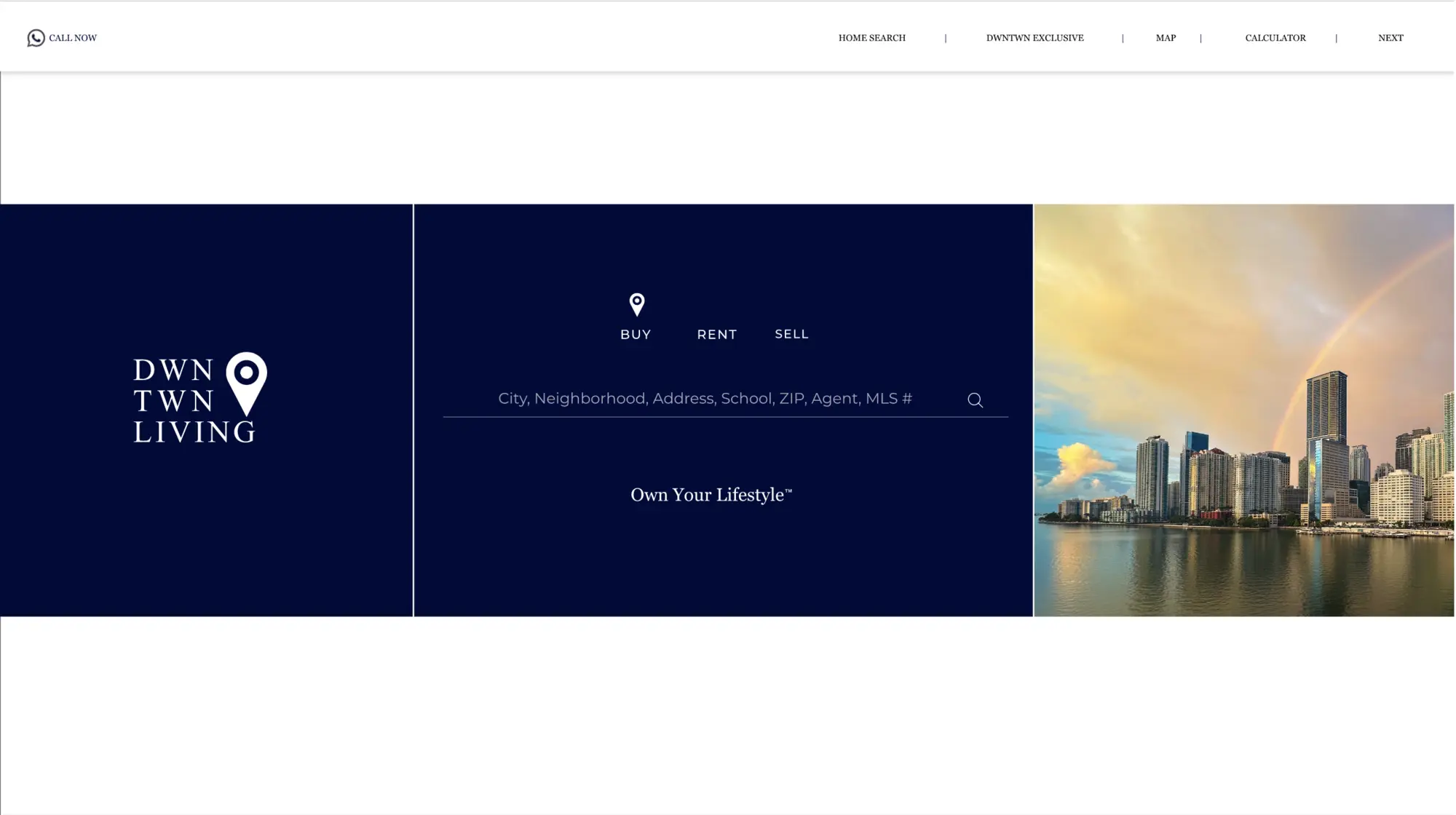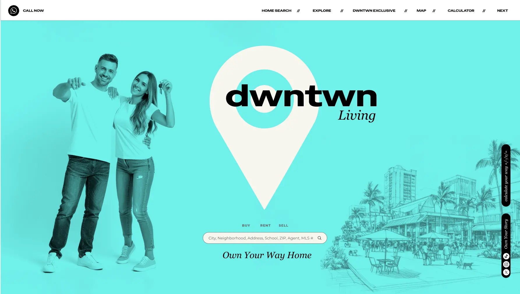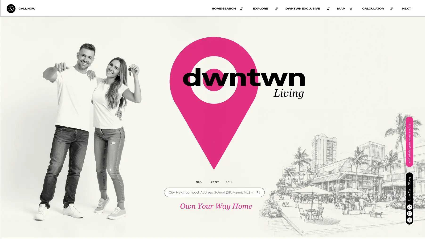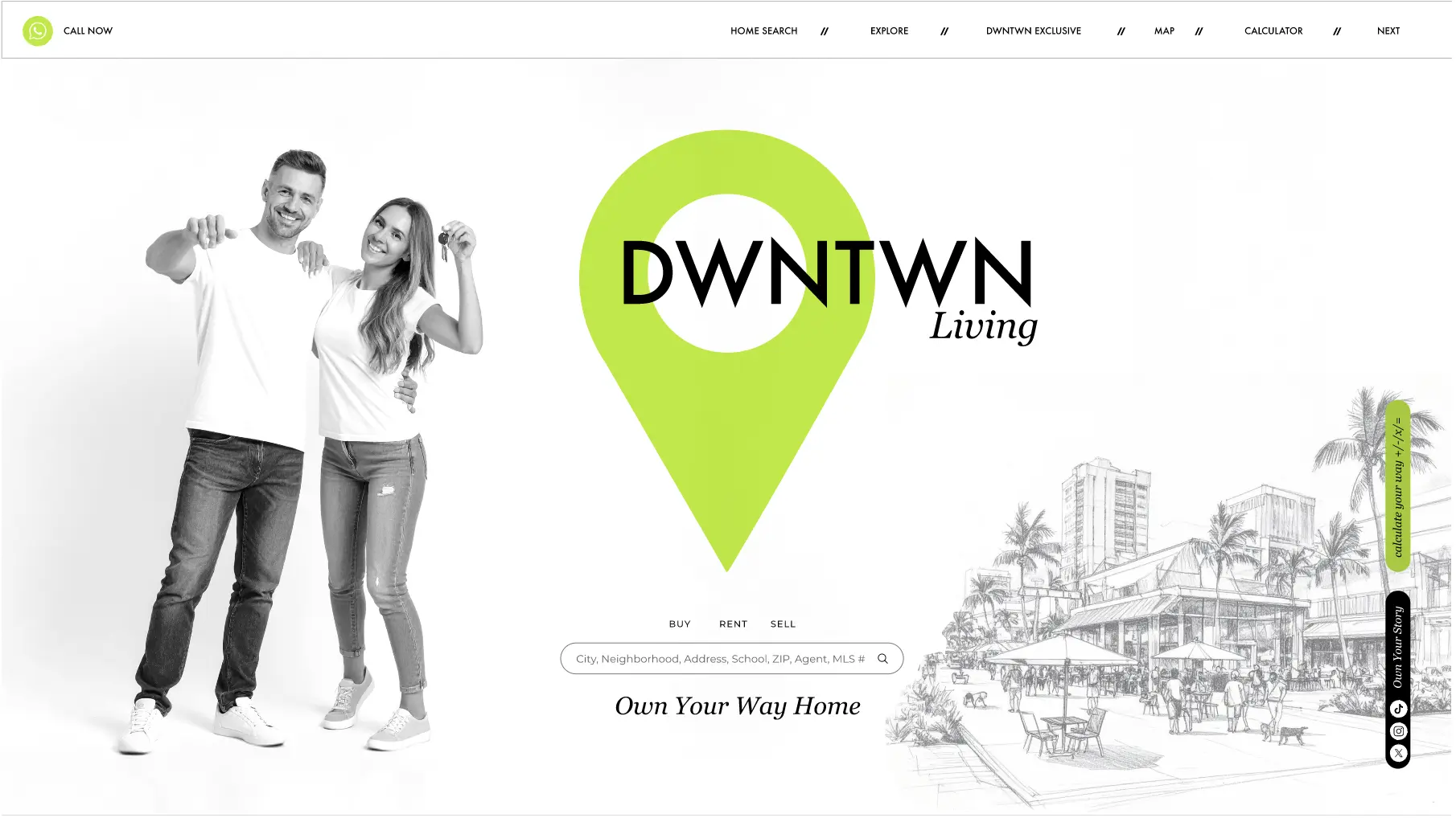
Founded by two brothers who believe finding a home should feel personal, DWNTWN Living needed a brand that stands out from afar without shouting. The answer was hiding in the name: a location pin drops into the wordmark and becomes the O, so the brand literally plants itself on the map. Bold, rounded “DWNTWN” carries the urban confidence; an italic “Living” adds the human accent.
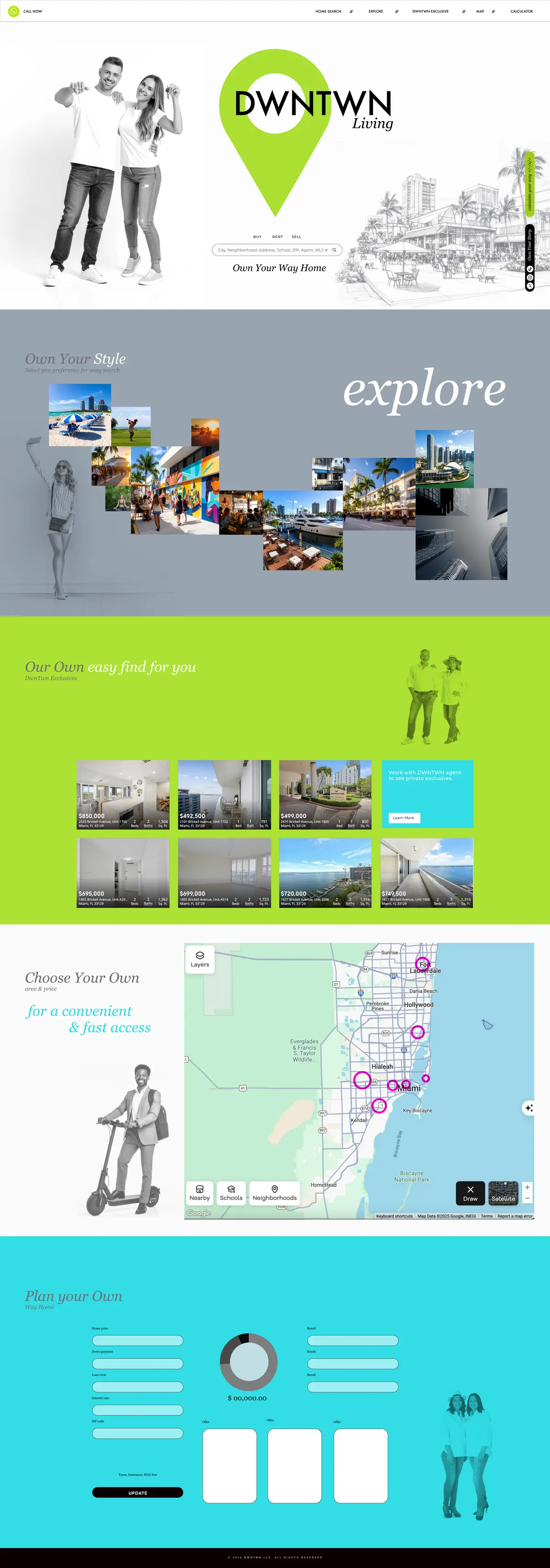
One word runs the entire experience: Own. Own Your Way Home at the front door, Own Your Style in explore, Our Own exclusives, Choose Your Own on the map, Plan Your Own at the calculator. A single language system walks the visitor from browsing to belonging.
The site unfolds as five full-bleed color fields — white, gray, lime, blue-gray, sky — with black-and-white lifestyle cutouts set against the saturated ground and a hand-sketched Miami streetscape at the door. A search-first hero (Buy · Rent · Sell), an exclusives grid, a live map filtered by area and price, and a mortgage calculator round out the journey — search and map wired to live APIs.